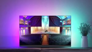
Picture this: Skin tones

As a professional calibrator, one of the most common reasons people ask me to tune their TVs is to obtain more realistic skin tones. Nothing jolts you out of an enjoyable viewing experience more than horrible-looking flesh tones, because these are part of a small group of colours called 'memory colours' – hues with which we are so familiar in real life that we instantly know if they don’t look right.
So why do skin tones invariably look wrong on a TV right out of the box? As usual, it's because manufacturers are trying to achieve bright, vivid images with their screens so they stand out in a retail setting against the competition.
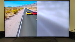
One of the sneakiest methods used to increase perceived brightness is by injecting higher amounts of blue energy into various shades of grey from black to white (known as 'greyscale'). The beauty of this technique is that it doesn’t increase absolute light output (and power consumption) by much, nor does it blow out the highlight details, but it does give the illusion of 'whiter' whites – manufacturers of PC monitors have used this trick for years.
On most modern TVs, each pixel is made up of three subpixels: red, green, and blue. To produce a neutral shade of grey, all three should fire at equal intensities: a dominant blue subpixel would result in blue-tinted greys; whereas a dominant red subpixel would yield red-tinted greys. A neutral greyscale is important to accurate colour rendition, as it works like a canvas upon which colour information is overlaid. If the underlying greyscale is blue tinted, then the tint would be transmitted to all the colours portrayed by the TV, leading to blueish skin tones.
Now, frosty skin tones don't look good, so to compensate many TV makers boost the intensity of red colour (an approach different from adjusting the red component in greys) to restore some pinkness to faces. While this works to an extent, it can't account for the wide range of complex flesh tones, and usually exaggerates the colour of red in everything else on screen. This is known as 'red push'.
Industry standardSo what can be done without recourse to pro-grade tools and software? Well, there's one thing in particular – switch to the most accurate picture preset on your TV! For Samsung, it’s Movie; on Sony, it’s Cinema; with Panasonic it's True Cinema or THX Cinema; for LG, use Expert or ISF Expert. These presets come closest to delivering a greyscale of D65, the standard adopted by the film and broadcast industry and employed on studio monitors throughout content creation/distribution. If you’re used to watching computer or laptop screens all day, initially the image provided by these more accurate presets may look too yellow, but persist with them and you’ll be rewarded with more realistic skin tones (and colours in general) once your eyes become attuned. These settings don't just reduce brightness and deactivate (much of the time) motion smoothing modes – they have an important impact on colour reproduction, too.
For a good image to assess skin tones, pause a BD of Casino Royale at around 00:25:53 after James Bond steps down from the plane – Daniel Craig's face should appear natural and healthy without excessive reddening of the lips. If flesh tones look overly hot (especially after switching to a warmer picture preset), you can try dialling down the colour setting. However, since this control affects all colours, including those unassociated with skin tones, be gentle and never decrease it by more than five clicks from default.


 |
Home Cinema Choice #351 is on sale now, featuring: Samsung S95D flagship OLED TV; Ascendo loudspeakers; Pioneer VSA-LX805 AV receiver; UST projector roundup; 2024’s summer movies; Conan 4K; and more
|
| Hardware | Software | Features Installs | Latest News Awards Newsletters | Resources | Subscriptions |
WHERE TECHNOLOGY BECOMES ENTERTAINMENT
 © 2025 Home Cinema Choice
AVTech Media Ltd
All rights reserved